Custom Modal API
The only intended use of this API is within the editor, do not make blocks to display these custom modals.
This API allows you to create ScratchBlocks modals meant to contain custom content.
To use this API, you need a reference to ScratchBlocks/Blockly:
/* get ScratchBlocks if availiable... */
if (Scratch.gui) {
    Scratch.gui.getBlockly().then(ScratchBlocks => {
        // ScratchBlocks can be used here safely
    });
}
Creation
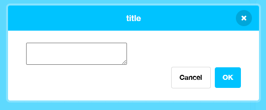
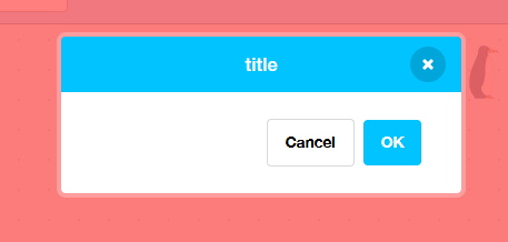
Here is a quick snippet of a customPrompt modal:
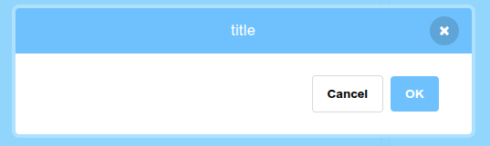
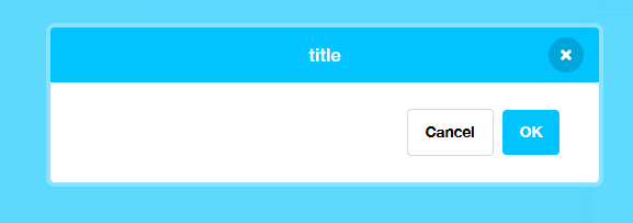
const modal = await ScratchBlocks.customPrompt({
    title: "title",
}, {
    content: { width: "500px" }
}, [
    { name: "OK", role: "ok", callback: () => console.log("Confirmed") },
    { name: "Cancel", role: "close", callback: () => console.log("Cancelled") }
]);
Modal configuration
The first parameter of customPrompt determines the configuration of the modal.
{
    title: string,
    scrollable: boolean?,
}
The only required property here is the title property:
It's recommended to set scrollable to true if your modal has resizable elements or can get really tall on the screen.
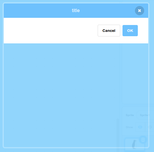
Modal styling
The second parameter determines the style of the modal on the page. This parameter is optional.
{
    content: CSSStyleDeclaration?,
    overlay: CSSStyleDeclaration?,
}
Both parts of the modal are a div. The content part of the modal is contained within the overlay div. Note that the entire modal contents (including header and buttons) are contained within the content div. If you want to style more parts of the modal, use the parentNode(s) of the element you are given after making a custom prompt.
If you want your modal to have a width of 500px you would set this in the content styles:
{
    content: { width: "500px" },
}
Note that using certain CSS styles like height and making them bigger than the content of the modal can cause the modal's outline to be larger than the modal.
You probably don't need to use a value other than "auto" for height, so it's best to either use that value or leave it out of the styles.
If you want your modal to have a transparent red background, you would set this in the overlay styles:
{
    overlay: { background: "rgba(255, 0, 0, 0.5)" },
}
You can have both content and overlay styles at the same time.
Modal buttons
The third parameter determines the buttons present on the modal. This parameter is optional.
This is an array of objects, with each object representing a button and some information + behavior.
Each button appears right-to-left in the modal. It's recommended to define your OK button first, then your cancel button elsewhere. Defining buttons in that order will match with other Scratch modals.
[
    {
        name: string,
        role: "ok"|"close"|null,
        class: "ok"|"cancel"|null,
        style: CSSStyleDeclaration?,
        dontClose: boolean,
        callback: function(): void
    }
]
The role property defines how the button should behave. Other interactions with the modal can trigger the button if it has a role.
- The
"close"role will run the callback when the button on the modal is clicked.
 - The
"close"role will run the callback when the modal is closed via Browser Back or the modal is closed by clicking outside of it.
Do not define buttons with the same role as another button, only use a role once.
The class property allows you to set predefined styles for the specified button.
The style property allows you to define custom CSS on the button.
The dontClose property will make the button not close the modal when clicked.
OK button
Most modals that perform an action should have an OK button. To create this button, use the "ok" role when making a button.
Here is a simple example:
[
    {
        name: "OK",
        role: "ok",
        callback: () => console.log("Confirmed")
    }
]
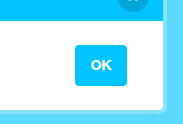
To use the OK button's styling on another button, set class to "ok".
Cancel button
If you want to have a literal cancel button on the modal, use the "close" role when making a button. The role name is different from "cancel" since this button is also used when the modal is closed by actions like pressing the button.
[
    {
        name: "Cancel",
        role: "close",
        callback: () => console.log("Cancelled")
    }
]
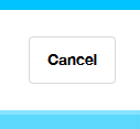
To use the Cancel button's styling on another button, set class to "cancel".
Adding elements
Now that you have your modal on the screen, you can add elements to it just by appending to the element returned:
const modal = await ScratchBlocks.customPrompt({
    title: "title",
}, {
    content: { width: "500px" }
}, [
    { name: "OK", role: "ok", callback: () => console.log("Confirmed") },
    { name: "Cancel", role: "close", callback: () => console.log("Cancelled") }
]);

modal.appendChild(document.createElement("textarea"));